Step 2: Draw the Marginal Cost Curve

|
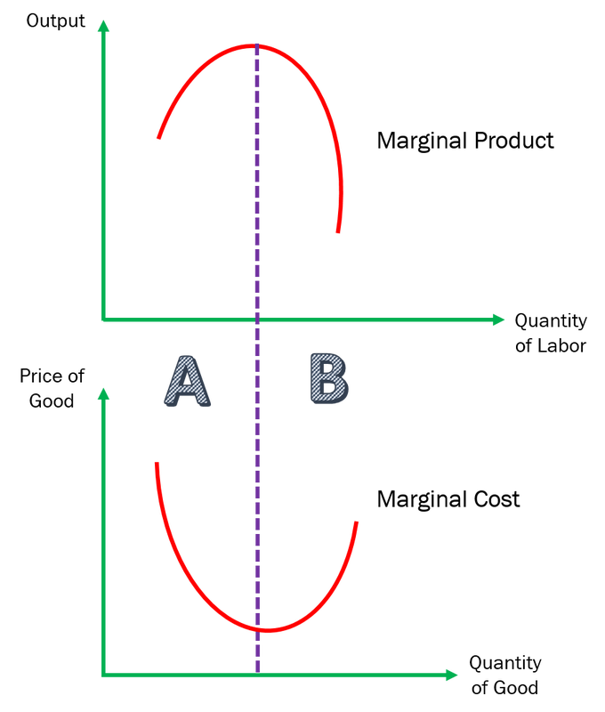
Explanation of the Marginal Cost Curve
At the Region A (to the left of the purple line), as the quantity of labor increases, the output of goods increase as well. There is a positive relationship. This is due to the specialization of labor, hence they are productive when producing the goods. At Region B (to the right of the purple line), as the quantity of labor increases further, the output of goods fall. There is an inverse relationship. This is due to unskilled labor, who are unproductive when making the goods. Applying this to the Marginal Cost, which is also reflected in the analysis diagram of OPEC's Cartel on Oil: 1. At Region A, the marginal cost to produce an additional unit of good decreases as the people are productive when producing the goods. 2. At Region B, the marginal cost to produce an additional unit of good increases as the people are no longer productive / specialize to produce the good. This explains why the Marginal Cost Curve is concave upwards. :-) |
