Step 3: Draw the Average Total Cost Curve

Explanation of Average Total Cost Curve
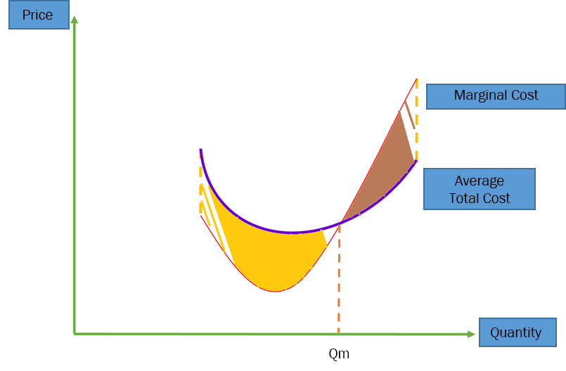
Firstly, both the Average Total Cost Curve (ATC) and Marginal Cost Curve (MC) will have a similar shape as they both accounts for the cost of the goods and services. Hence, both will be concave upwards.
Now we need to consider where do these 2 curves lie relative to each other.
|
Let's consider 2 parts of this diagram - The yellow portion and the brown portion.
1. The yellow portion. At the yellow portion, the Marginal Cost Curve lies above the Average Total Cost Curve. Based on the Marginal Cost Curve, each additional unit of good is at a lower marginal cost i.e. the marginal cost of an additional unit of good introduced to the market is lower than the previous unit of good. Adding in a good with a lower marginal cost than the previous good lowers the average cost of the good, based on logic. Hence, the ATC lies below the MC until Qm. 2. The brown portion At the brown portion, the Marginal Cost Curve lies below the Average Total Cost Curve. Based on the Marginal Cost Curve, each additional unit of good is at a higher marginal cost i.e. the marginal cost of an additional unit of good introduced to the marker is higher than the previous unit of good. Adding a good with a higher marginal cost than the previous good increases the average cost of the good, based on logic. Hence the ATC lies above the MC after Qm. |
